

82
/ 100
SEO score
Interactions in a web service need continuous review and improvement to make the service easy for users to use.
Keeping up with all the trends in this field can be overwhelming.
Below I explain some successful interactions that may help you.
1. Design with clarity
Before doing a review, ask yourself these questions about the web service interface:
- Where am I?
- What actions are possible?
- Why would I take those actions?
- What will happen once I do?
For all this, it is important to study user behavior and flows to know how to get the best response and improvement. These can help:
- Choose the right user interface patterns: Use sites such as UI pattern libraries and free guides like mobile UI patterns and web UI patterns to learn the popular design solutions for common problems. For example, cards are popular because they help organize large amounts of content. Hero images are great for product sites because they leave an immediate impression. Use these patterns as a starting point and then add a layer of your own creativity.
- Don’t break mental models: Design based on what people are already familiar with. The icon at the top left should link back to the home page. Calendars should let people pick dates, instead of forcing users to type in the day and time.
- Use good copy: Make sure the tone of the copy matches the visual design, since everything is part of the same interface. Any mismatch can confuse users.
- Include meaningful labels and icons: Don’t get too clever with how you label interface objects such as navigation. It should be clear what is and is not clickable.
Let’s take a look at the home page of Tictail. Sure, it doesn’t look particularly clever or mind-blowing, but that is not the point of the design. It is, however, extremely clear.
The overall design is clearly inspired by flat design principles, but the buttons still have a tactile feel thanks to the rounded corners. This way the buttons encourage interaction better (which makes a lot of sense for the business, since the two are test CTAs). Color helps tell the two CTAs apart, as one is blue and the other is white.
On a more subtle note, see how the hamburger menu is also labeled to make it more visible. The body text also follows a C-shaped reading pattern to reduce visual strain, which leads users naturally to the free trial CTA.
Remember that clarity is not the same as simplicity. Not every good design is simple: just think of the technical complexity behind the iPhone, or all the dating sites that let you choose partners based on almost any criteria. But when these features are paced and presented correctly, they achieve greater clarity, which always encourages interaction.
2. Create a design guide with user interactions

Risks can be smart when they are calculated and deliberate. But unintended risks lead to regrettable consequences. The same happens when you design based only on trends.
Designers should focus on user needs and not exclusively on the latest trends that bring no clear functionality for the user.
The best option is to listen to user feedback, which is the easiest way to unlock specific design requirements. User feedback is often treated as a nuisance to be ignored. But there is a gold mine in those comments and they can be very useful to improve your designs.
A great tool for listening is Get Satisfaction. Its features are designed to evoke honest discussions. The greater the transparency, the greater the insights.
3. Ask the right questions by watching user behavior
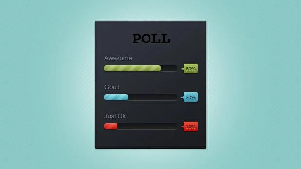
Interaction design requires user participation. If users don’t take an action, there is no interaction. Learn from Etsy by creating A/B tests: don’t think, don’t guess; test and draw your own conclusions.
These practices are carried forward in the lifecycle methodology of UX Lean, which dictates that you should always iterate designs based on hyper-focused usability studies. To do this, use analytics tools, heat maps and eye tracking to observe behavior.
Finding the right design solution starts with asking the right questions. But figuring out which questions to ask takes some time and practice. Once you have observed your users, try the IDEO Method Cards to discover the reason for probing and identify the root of a particular design problem.
4. Know when to abandon ship
Sometimes designs just have to be thrown in the trash. Design for long enough.
Signs that your design is not working include:
- Users get stuck in an endless loop
- The space doesn’t fit the necessary content
- Users get confused or overwhelmed
- The content takes too long to load on the device or browser
- The design doesn’t work in different languages
- It can’t be integrated with main services
- Users don’t use the design as intended and end up with error messages
That is why it is important to start working on the design in a sketchbook or on a whiteboard.
For me, rapid prototyping with a tool like UXPin helps with iterative design, making me solve problems before I commit to a design idea.
Learn to fail fast and move on. The faster you recover, the faster we will reach the right design solution.
Conclusion: think like a service designer
Products are often just one part of the user experience. If you consider how product teams are built, a user may interact with several products at once. Sometimes the products are on the same website or app, but other times a user might interact with unrelated products.
Consider a user looking for travel information. Users may use products such as a currency exchange calculator, a flight search engine, an international ATM locator, an accommodation search engine, a calendar, an email client, and so on, and the user might use several devices at the same time depending on their preferences.
When you know more about a user’s context and motivations and their interactions with a particular product, it is possible to create a service map or customer journey. These tools help you bring the user experience to life and create interaction design patterns that support user needs.
When you realize this, your product will be able to design interactions that give added value that others don’t.