
79
/ 100
SEO score
User experience in mobile apps is very important. Today, part of our digital life happens on a smartphone. This has led companies to focus part of their activity on this environment, such as daily transactions, decisions and activities. It is not only about bringing in followers and potential customers, but also credibility and reputation.
Just look at some of the most successful and well-known brands. Haven’t you noticed that all of them have a mobile app? This shows how important a mobile app can be in a marketing strategy.
Before creating a mobile app you must keep in mind that the design must be effective, and the mobile user experience will be a great start.
Not sure where to start?
Let’s look at the best design and user experience rules for mobile apps that you can use.
Keep physical constraints in mind
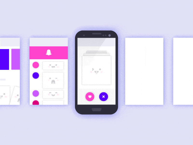
Mobile phones come in different shapes and sizes. You will also have to take into account different operating systems, such as Android y iOS. When it comes to mobile UX design, you must present several design versions that fit the interface, navigation and functionality of a device.
For example, an iPhone has a single button that has multiple purposes, while Android offers multiple buttons for interaction. Obviously, they require different approaches when designing and planning.
It is important to keep the different screen sizes in mind. This simply means it must adapt to multiple screen sizes, making reading and navigation easy and possible.
If you already have a website, it may seem acceptable to take everything from there and turn it into an app. Effortless, cheap and practical, right? This is the worst idea you can have for your business, since all you will get is to lose credibility, followers and money.
This leads us to our next principle: become the audience.
Put yourself in the place of a “user”

One of the best practices is to see your work through the eyes of a user. I know it is unavoidable to look at your own work in a too positive light. However, it blinds you to the improvements and adjustments you need to make.
If you really want your project to shine brighter, you must determine what you can do to make it happen. This can be possible by putting your mind in the perspective of a possible visitor.
For example, your target audience is toy collectors. You must take into account their needs, motivators, preferences and behavior. With these factors in mind, you can browse through your project and possibly gain insight into what it does well or badly.
At all times you should answer these questions:
- Does it perform the function it was originally meant to?
- Is it useful for the target audience?
- Will it boost the name and reputation of the brand?
If you want more information and precise results, you can set up a small test group. It would be ideal to gather people who could benefit from the app. They can give you useful comments and opinions.
You may be interested in: How to use a heatmap to improve website conversion
Be minimalist

The minimalist approach in design is what is used today, so use it in yours.
A pattern that follows a minimalist approach is ideal for creating a pleasant experience for mobile users. On a significantly smaller screen, they don’t need apps or websites full of excessive decoration. What they look for is functionality and ease of navigation.
This is where a designer’s creativity will really shine. It is easy to make a simple design, but it can be a challenge to make it outstanding. Once you get the perfect balance between simplicity and uniqueness, your app or website will stand out.
Know your colors

Colors play a vital role in design. They are not only meant to bring life to the app or website, but also determine the tone, mood and message it conveys.
If the business is related to the food industry, what do you think is the best color to use?
According to color psychology, red is the most powerful choice to increase your sales. Take a look at McDonald’s, KFC, Pizza Hut and Coca-Cola. One thing they have in common is that they use red as their brand color.
There is only one reason why these brands chose the same strategy: it is effective. This color is known to stimulate a person’s appetite and taste buds. When combined with other suitable colors, it can intensify the brand message.
Research your own color and what you can do in the design. Make sure it follows the path to reach your goals.
Take note of gestures for an improved user experience

You must keep in mind that buttons are not the only interaction. You must take into account the user experience in gestures. This will help you know the best way to interact with them in the actions you want to carry out in your mobile app. Some of the most used gestures include pinching, double tapping, scrolling and swiping.
For example: in earlier versions of the Instagram app, it was not possible to zoom into images. This action is usually the result of a pinch, which is the common gesture to zoom in / out. Users felt limited in their actions, which means they were not getting the best mobile user experience. Fortunately, in its most recent updates, they addressed the problem.
It is also important to take note of the different gestures used on different platforms. A gesture that might work on an Android phone might not work on an iPhone.
You may want to add some animations every time a gesture is performed. For example, pulling down has become the universal gesture to refresh an app. Make it exciting by adding something that can play with your visitors’ eyes while they wait. Some apps use the circular loading indicator, but you can always add your own flavor. Keep it unique, simple and a bit subtle.
Hand-to-screen interactions

If you don’t have your phone, grab it now and open an app you use regularly. Look at your fingers and where they usually land or interact.
Are they easy to reach and press? If not, does it cause strain in your fingers and / or wrists?
When you design an app, don’t forget to consider the users’ physical comfort, because this is where the user experience lies. If you notice that the placement of buttons or content can cause the slightest discomfort, it would be better to redesign. Users tend to stop using the app when it turns out to be too hard to navigate.
Another thing to consider is the size of your buttons, content display area, text boxes and more. For this, you must take into account that people also have various screen sizes and various finger sizes.
Don’t design the interface based only on the size of your fingers and your screen. A user experience carried out by some doesn’t have to work for others. If you want to be sure, you can gather people with different characteristics to test it.
Pay attention to user feedback and data

When you create a strategy, you need to know how well it works. It will not only help you measure your success, but also get insight into what you might need to improve.
The number one goal is to provide a satisfying user experience for users. Receiving accurate feedback about your app will immediately tell you what is working and what is not. With this data in hand, you will know what you need to change, review or add.
For example, you notice a sudden drop in the number of installs. What was done wrong for people to uninstall the app? You won’t have to guess any more, because the analytics app will tell you the information you need to know.