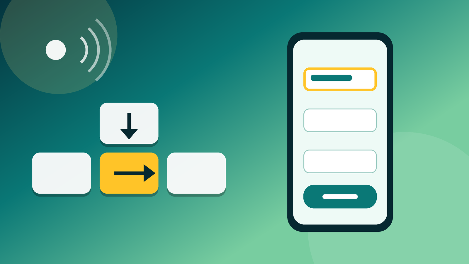

Imagine a normal checkout flow: cart, shipping details, payment, confirmation. It has been designed with care, it looks good, it converts reasonably well. Now try to complete it without a mouse, using only the keyboard. Then with a screen reader. It is an exercise of a few minutes and it usually teaches more than any report. This case is hypothetical, but the failures that show up are among the most repeated in digital products, and since 28 June 2025 web accessibility has been mandatory for many services, so there is also a legal side.
In short: Since 28 June 2025, web accessibility is mandatory for many digital services aimed at consumers in Spain (Law 11/2023, which transposes the European Directive 2019/882). It is cheaper to design it in from the start than to fix it at the end.
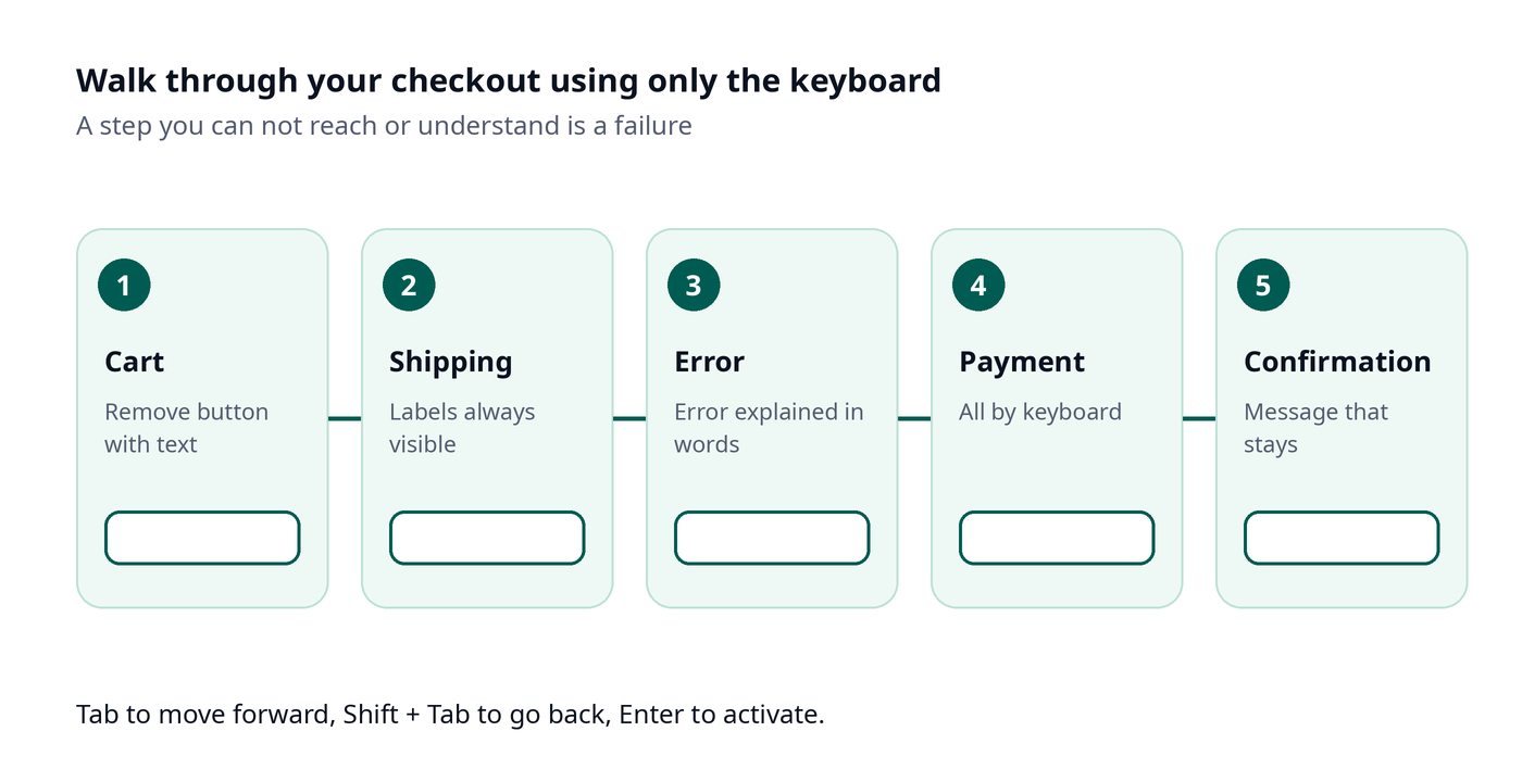
Where it breaks, step by step
The cart. The “Remove” button is an icon with no text. With a screen reader you hear “button”, and nothing else. With a keyboard, you can’t reach it.
The shipping form. The fields have example text instead of a label. When you type, the label disappears. Someone using a screen reader doesn’t know which field it is, and neither does someone who has trouble remembering.
The error. You made a mistake in the postcode. The field turns red and that’s it. Nothing says what happened or where. If you can’t tell red apart, you don’t even see there is an error.
The payment. A custom dropdown to choose the method that only responds to a click. The keyboard gets trapped.
The confirmation. A message that appears for a few seconds and disappears. If you didn’t see it, you don’t know whether you bought.
None of these failures is a code bug. The developer implemented what they were asked. The failure is in the screen, in the user story or in the acceptance criterion, that is, in an earlier decision.
What each moment costs
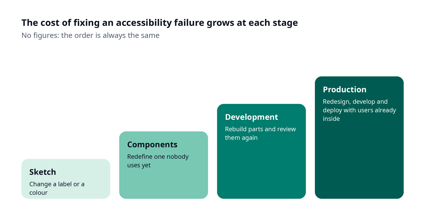
I’m not giving figures, because they depend on each product, but the order is always the same:
| When it is detected | What it forces you to do |
|---|---|
| In the first sketch | Change a label, a color, an order |
| In component design | Redefine a component nobody uses yet |
| In development | Rebuild pieces and review again |
| With the product in production | Redesign, develop, test and deploy, with users using it in the meantime |
That cost step is, for me, the strongest argument, more than the law. And in teams with several suppliers it goes up another step, because each round requires coordination.
Why it is always left for the end
There is a fairly human explanation. Web accessibility doesn’t show in a demo, it doesn’t make anyone say “that looks great”, and when there is a rush it is the first thing to be parked. Also, whoever decides the design is rarely the one who later tests with a keyboard or a screen reader, so the failure isn’t seen until late. It is an invisible requirement while it works and very visible when it fails.
That is why I think it is not a matter of raising awareness, but of putting it where decisions are already made: in the component system, in the acceptance criteria and in the review of each delivery. If it depends on someone’s goodwill, it falls apart the day there is a rush.
Mandatory web accessibility: what the rule says, without playing lawyer
The Directive (EU) 2019/882, the European Accessibility Act, was transposed into Spanish law with Law 11/2023. It sets web accessibility requirements for certain products and services, and its effective application ran until 28 June 2025. Among the services affected is e-commerce aimed at consumers, along with others set by the law itself.
The Directive exempts microenterprises that provide services: fewer than 10 people and a turnover or balance sheet not exceeding 2 million euros. The exemption does not cover products, so each case should be checked.
How to avoid the walk-through above
I have worked organizing UX, development and SEO teams, and web accessibility is like any quality requirement: it works if someone is responsible and if it is written down. On the user experience side I already wrote about design rules for a mobile app and about building a good app thanks to UX.
- Once, in the design system. Contrast, sizes, focus, error messages and touch areas defined in the components. If the component is born accessible, everything that uses it inherits it.
- In the definition of “done”. Each story includes that it can be used with a keyboard and understood with a screen reader.
- In the demo. Testing with a keyboard and a screen reader is part of each delivery, five minutes and no separate audit.
- In the agreement with suppliers. If it isn’t written down, each one will understand something different. WCAG level AA is usually used as the technical reference.
- With the product live. A portal that is accessible on launch day stops being so if every new piece of content comes in without criteria.
What changes when there are several teams or suppliers
With a single team, accessibility depends on that team being clear about it. With several, it depends on everyone understanding the same thing. One supplier builds the components, another the templates, another integrates the content, and the failure can appear at the joint. What usually works is having a single criteria document, seen by everyone on day one, and a person who can stop a delivery if it isn’t met. Without that document, each piece complies on its own and the whole fails.
It also helps if the tests are shared. If each supplier tests in their own way, nobody can compare. A common script of five or six checks, with keyboard and screen reader, is enough to start.
What the product gains, beyond the law
What is accessible is usually the easiest to use for everyone. An explained error is always appreciated. Good contrast, on a phone in full sun. Navigation that doesn’t depend on a gesture works with one hand busy. I believe that in quite a few cases improving web accessibility improves conversion without anyone intending it. I’m not promising it with figures: it makes sense, because removing obstacles means more people reach the end.
How I explain it to a client
The client isn’t interested in the directive. They are interested in whether they may have a problem, how much it will cost and what they have to decide. I would tell them which of their services fall within the scope, what the product meets today and what it doesn’t, and I would propose a phased plan with dates. I wouldn’t promise full compliance without having tested with real people: an accessibility statement with no checking behind it is worse than an honest list of pending items.
If you want us to look at your product, here is my page on product design. And if you have a live product, start today: choose the flow that brings in money and walk through it with the keyboard. The list of blockers that comes out is the first work plan.
Frequently asked questions
Since when is accessibility mandatory in digital services in Spain?
Since 28 June 2025, with Law 11/2023, which transposes Directive (EU) 2019/882.
Which services does it affect?
Services aimed at consumers, such as e-commerce and others set by the law. The Directive exempts microenterprises that provide services, something to check case by case.
When is it best to take accessibility into account in a project?
In the design and in the definition of each story, not in a final review.