
76
/ 100
SEO score
I want to provide a list of the usability resource trends that are most used or are starting to appear in different web projects.
The resources presented are not based on data, but they are resources I am starting to see more and more often on sites, and they are innovative compared with the current way of showing content.
Some of these predictions will be more obvious than others, but I decided to show what is “likely” rather than “extravagant”.
Parallax effect
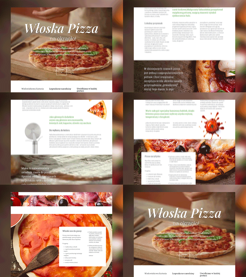
The parallax effect is produced by scrolling either vertically or horizontally, which makes the objects and backgrounds move at different speeds and directions. They are created with several layers, placed at different positions and distances from each other, which gives a visual effect similar to 3D.
This type of resource is starting to be widely used, especially on promotional sites or landing pages where very high visual impact is sought.
Card design
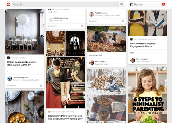
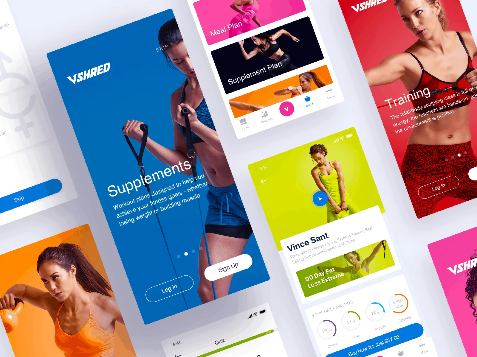
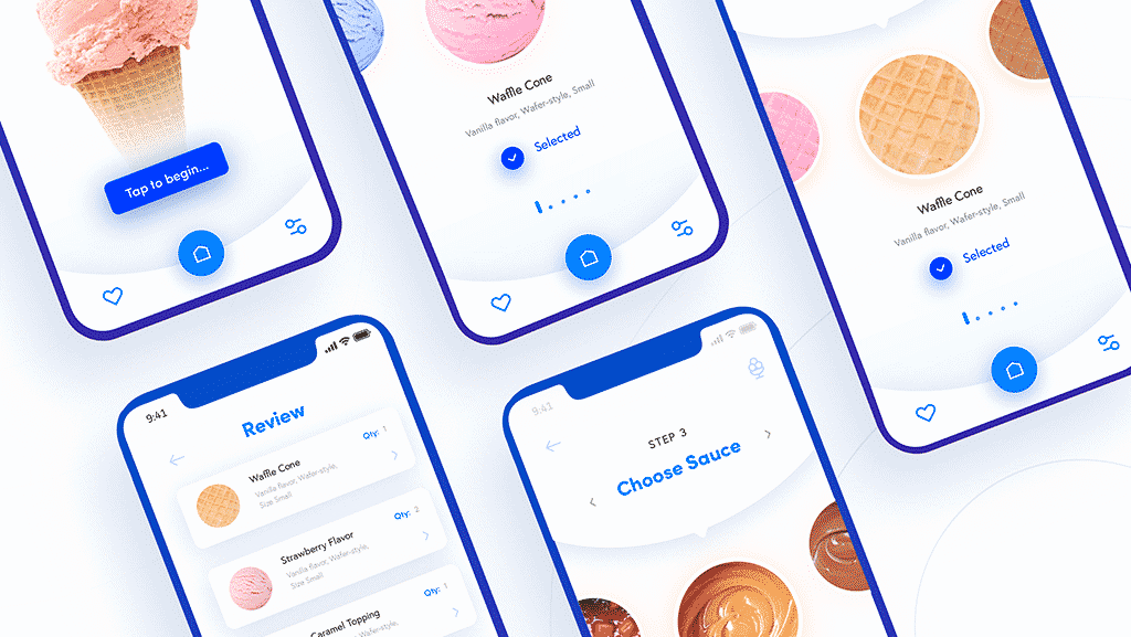
This type of design is based on creating a themed element that holds a series of features, so it is easier for the user to find which action to take for a type of content.
This type of design is very useful, for example, on mobile devices, and it is a trend that is appearing more and more often for that reason.
Material Design
This framework or style guide is the meeting point between skeuomorphism and totally flat design. Google invented it, quote:
Material is grounded in tactile reality, inspired by the study of paper and ink, yet technologically advanced and open to imagination and magic.
From a usability point of view, it is a trend that is gaining more and more relevance, since it started by improving the user experience in Android apps, but that development has moved to the web world with the aim of unifying the user interface.
If you want to know more, go to this post about Material Design
Ghost buttons

Like a mysterious ghost peeking out from the corner, ghost buttons are not meant to distract, only to draw attention in a subtle way.
They are transparent but have a recognizable shape, bounded by a very thin line, and contain light sans-serif fonts.
Their purpose is not to stand out and make a strong call to action. They are perfect for designers who do not want to clutter their sites with navigation, even if it is necessary.
Speed
This subject is important and many people skip it until a disaster happens. More than a trend, it is a reality.
From a usability point of view, it is not only the correct organization of elements and interactions that matters, but also advising that design vs. data loading speed be as balanced as possible, without falling into either extreme.
Micro UX
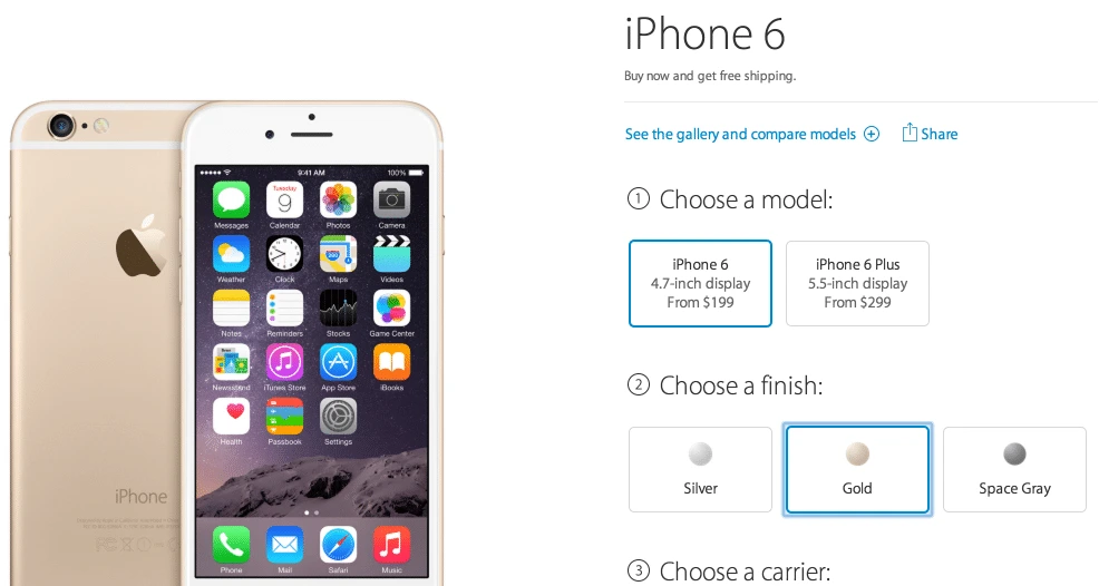
Micro UX design of process improvements, both from the functional point of view and the innovative use of simple design that not only makes a task easier but also creates an engaging usability experience.
On many occasions small usability process improvements lead to an improvement in the purchase process, login… resulting in a higher percentage of purchases, user registrations…
Hidden menus
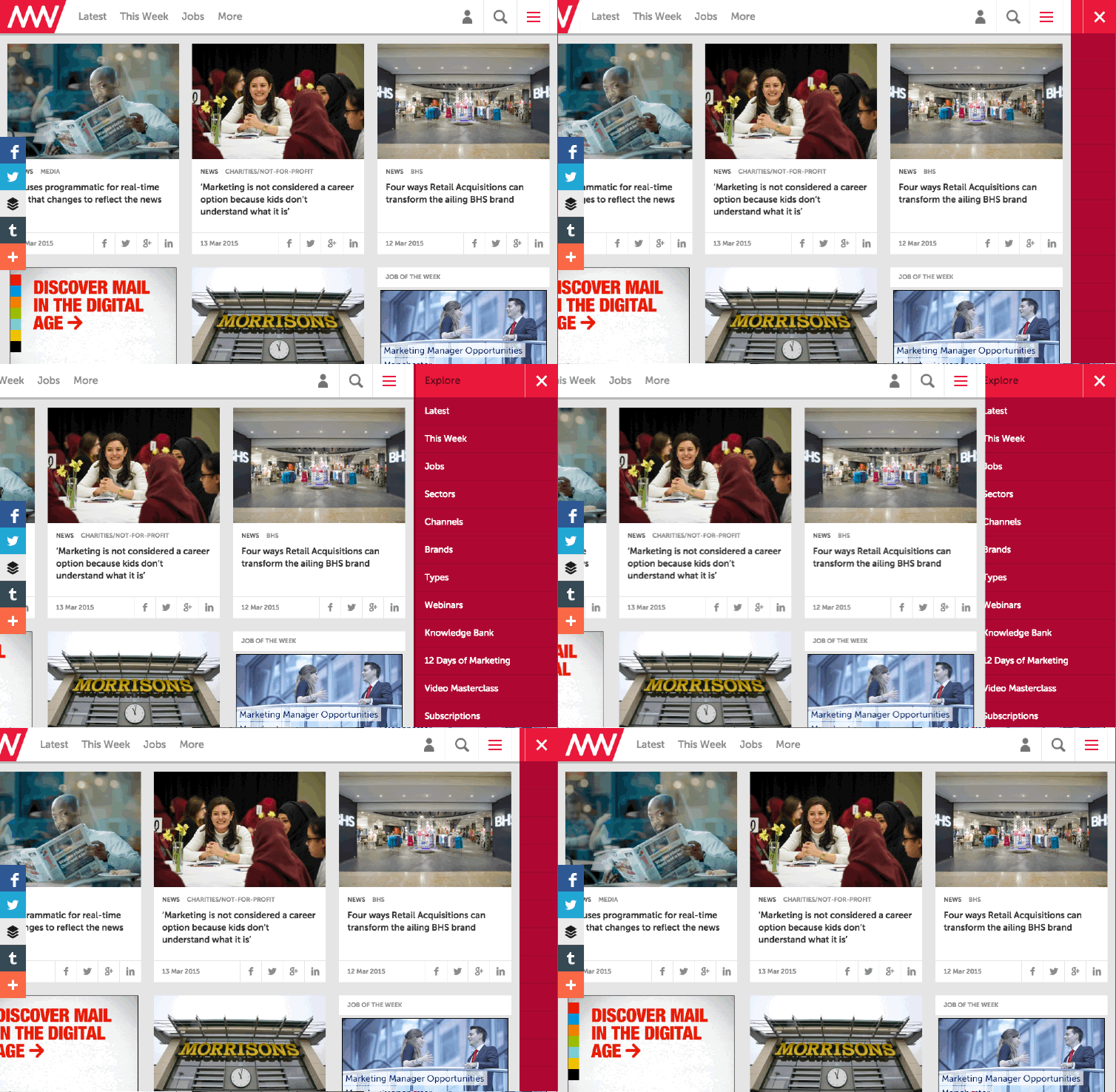
The hidden menu, or as I call it the hamburger, is a resource inherited from mobile devices that is slowly becoming more popular on websites to hide the navigation screen until the user interacts with the menu element at the top left or right of the screen.
The benefit is that it gives more importance to the content by offering greater visibility; the drawback is that not everyone is ready for this structure on the web yet and it can be confusing.
Anchored elements
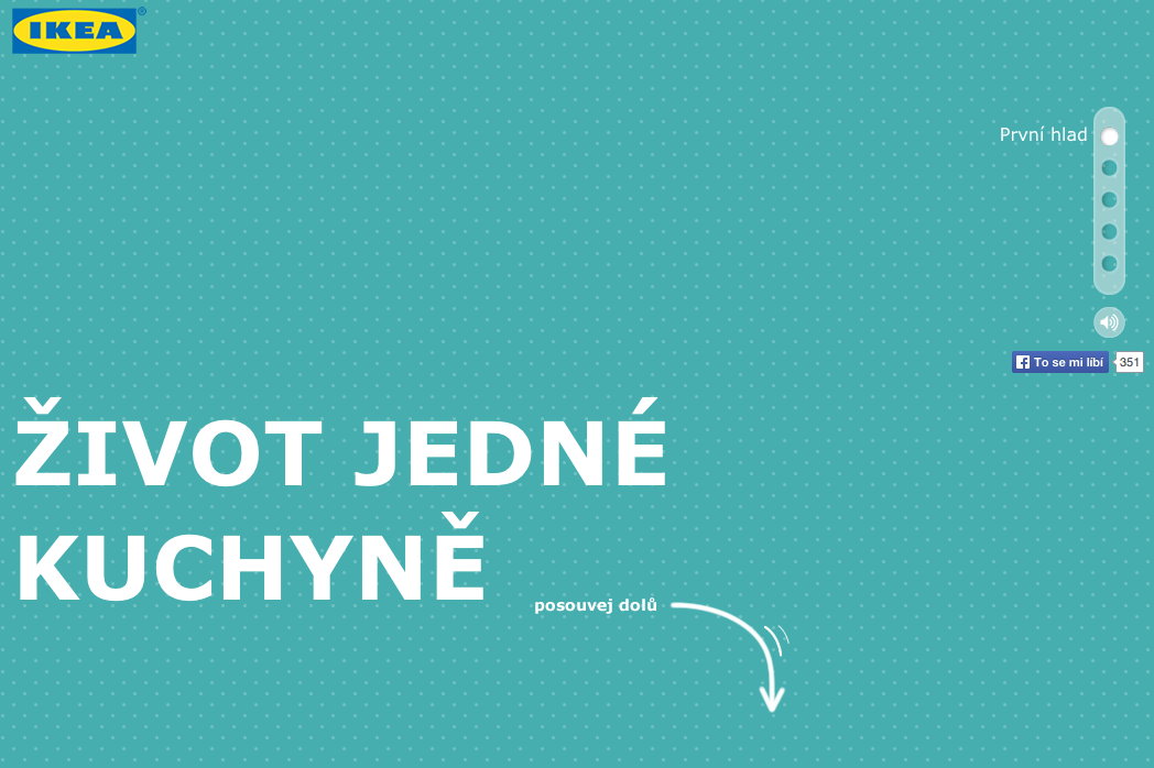
This resource is used a lot on landing pages with a very long scroll. It lets the user know where they are and how much is left to finish, and also helps them navigate the site smoothly.
As I said, from a usability and also accessibility point of view it is highly recommended to use this resource for landing pages with significant scroll.
High-resolution screens
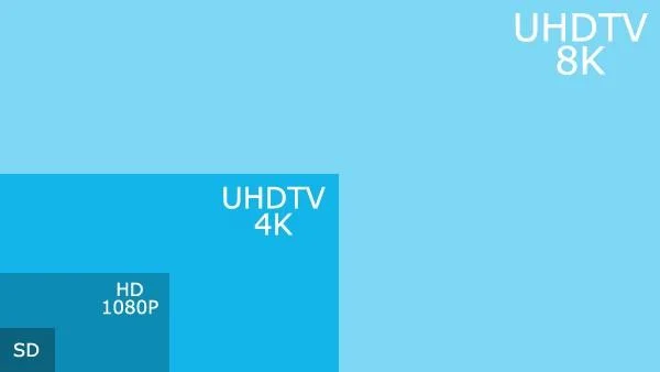
Although there is plenty of talk, the trend of recent years has been responsive design for mobile devices, and the new dimensions of high-definition screens such as 4K, which can be useful to offer the user more information about the web service, have been left aside.
Brands are expected to adapt to the experience of giant screens at the office and at home.
Anchored and slim menu

The usability trend in recent times is to slim down menus in order to give more visibility to the portal’s services and content, but the menu does not lose importance because of it, and it is emphasized by anchoring it to the top of the screen, creating easy access to other parts of the web and speed.
Motion design
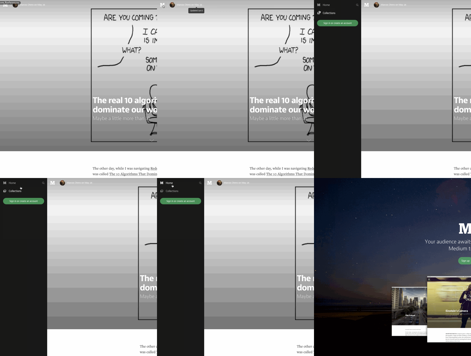
Interactions are one of the parts that stand out most in recent times from a usability point of view, since sites are no longer static and are being given life with movement at each step of the user through the site, with the aim of surprising them or attracting them to a certain action. It is important to know when to use it and not overuse it, since it can overwhelm the user and the device’s resources if it does not have large resources.
The most used interactions are:
- Infinite scroll: each time the user scrolls down the site, content is loaded, very useful to make the site’s response time faster
- Animated dynamic graphics: make the results more attractive
- Modular scrolling: scrolling in individual columns as well as whole pages.