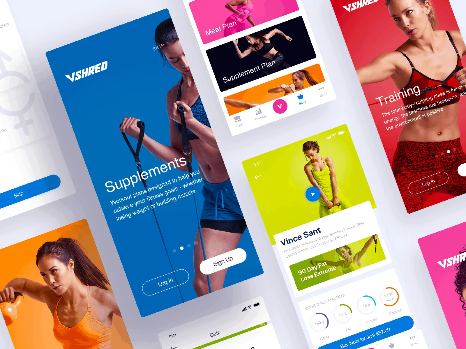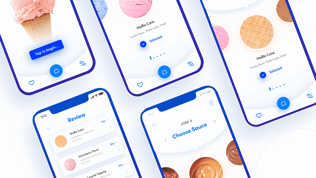


Let’s look at 6 tips for designing a mobile app that can be very important for the product, such as the user interface, user interaction and ease of use.
Before you start designing an app, you need to take into account lthe Five Pillars of Interaction Design with tips on creating native app interfaces:
- The goal of the design: Before designing, you need to do some prior user research, such as surveys and interviews, which will help you profile the users most likely to use the app and their needs. This lets you create specific goals for your users and adapt the app’s workflow to meet those needs.
- Usability: This seems obvious, but the app has to be usable. If people can’t use the app, it won’t be used and it will have been a wasted investment. Usability makes a product useful, which is the first step toward being desirable.
- Affordances and signifiers: The affordance is the function. Signifiers hint at affordances. For example, blue, underlined text indicates that clicking on it will take you somewhere else. Use signifiers correctly so users don’t have to think about what each UI element does.
- Learnability: The app should have an easy-to-use interface so that people can navigate it intuitively. This is where design patterns are useful. The interaction standards of the different mobile platforms help a new user adapt easily to an app.
- Feedback and response time: User ratings are important to fix the shortcomings the app may have and improve it in the near future so users keep using the app.
1. Know your users
Screen size is not the only obstacle in mobile design. Users form the basis of your interface’s constraints. So the first step in creating a goal-driven app UI is to know your users.
There are three fundamental tactics for understanding your users, as highlighted in the Freebie Guide to UX Design Process and Documentation:
- Personas: are fictional characters formed from the expected behavior of target users. They let you determine what will drive users’ decisions within your app.
- User scenarios: Scenarios give an idea of how a persona will act. With user scenarios, you can design a user interface that best fits them and the goals you want to achieve.
- Experience maps: Here all the possible conditions for a single interaction are explored. Experience maps trace each step personas are most likely to take while using an app. They help you understand all the emotions and circumstances around those steps.
It is important to make sure you run usability testing sessions between each major iteration. At a minimum, run some remote usability tests with a service like UserTesting so you can see how people use the app in natural environments. For more ideas about behavioral nuances (for example, gestures and body position), it is recommended to run an in-person lab session with at least five users.
2. Map content and user flow
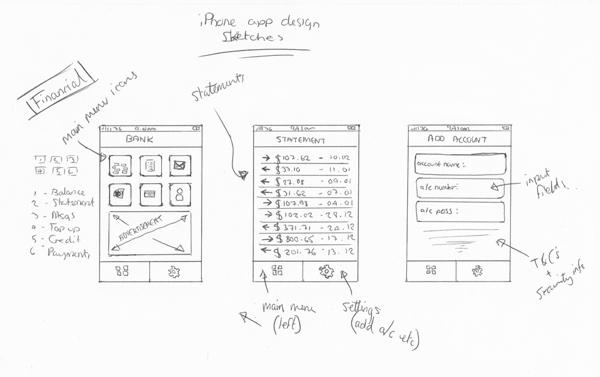
Design and research must work in parallel. For example, you can quickly sketch user flows based on what you have learned so far. Before committing to a path, however, create a simple prototype. It doesn’t have to be anything fancy; the prototype can be made on paper so you can start to understand how users flow between content and actions.
If you want to sketch the flow, you can use the writing-first method that Jessica Downey describes in her excellent article “Jumpstarting Your App Conception Without Sketching UI.” This method helps you generate app ideas and build a “common understanding” of each page of the app.
Before drawing or prototyping, a written outline helps you explore the most important part of your app: the content. Building out the content gives a much more accurate estimate of the total number of pages your app needs.
As a next step, you can create a sketch for each page of your flow. From there, you can continue the interaction with paper sketches and cut them out for a paper prototype, or move to a digital prototyping tool.
The outline helps you quickly explore different page flows. The sketches bring the flows to life with more detail about layout and structure. Finally, a quick prototype helps test those ideas with users.
3. Improve usability with mobile defaults
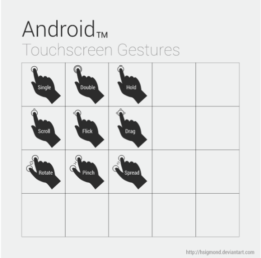
Mobile design revolves around many device-specific nuances, such as thumb placement, orientation and posture.
Examine popular interfaces and study the patterns of common phones, such as swipeable navigation. This will let you create a user interface that makes users “feel at home”.
We are not suggesting copying other people’s designs, but using them as an example. Use common UI patterns as a basis for ease of use and then add a layer of your own creativity. This way, you make sure your app’s design matches user expectations without feeling boring.
There are two categories of interaction design patterns you must master for good mobile design.
- Gestures: Touch devices are defined by gestures. Tapping, swiping, double tapping, pinching and zooming are becoming second nature to users.
- Animations: Motion keeps users grounded in the UI while adding context. There is a difference between elements that fade away and those that slide out of view. The first is deleted; the latter is available for later use. When animations are combined with gestures, they add another depth to the experience.
Mobile interaction patterns help dictate the layout of common interface elements. For example, navigation buttons at the bottom of the screen are easier for users to tap with a thumb than buttons at the top.
Text is also important to prompt the user to take the action you want. Some tips for text:
- Phrase labels positively so users feel in control.
- Important words should come first. Mobile users are especially impatient, so use “Full name” instead of “Name”.
- Wording should be consistent and have a uniform style across every screen.
4. Design for fat fingers
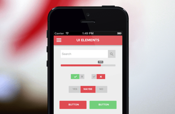
Fingers are much thicker than precise mouse cursors in pixels, so you must pay attention to finger-friendly design.
Specifically, leave enough room for users to tap with one finger. If buttons are too small or grouped too close together, users can’t use them reliably, which increases frustration and therefore abandonment.
Tips to keep in mind when designing buttons and other touch targets:
- We hold our phones in different ways. There are three ways to hold a phone: one finger / one side, two hands / one finger, and two hands / two fingers. There are also different ways for tablets, but users mostly hold tablets by the side.
- Fingers are fat. They are currently about 45 to 57 pixels wide, which is larger than what most guidelines recommend for touch targets. For example, Apple recommends about 44 square pixels.
The 44-pixel guideline is not always right. Normally you don’t want to design a button so large that people don’t think of it as an action. However, you must keep in mind people’s fingers and how they will interact with the app.
5. No gradients or shadows just yet
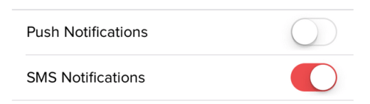
Flat design is Apple’s new style since it abandoned skeuomorphism.
But that doesn’t mean shadows and gradients are dead. They have found their way back into design. Just look at Google’s Material Design to see how they have made a strong comeback.
When thinking about buttons, toggles and other visual cues, you should consider using shadows.
Shadows and gradients: before using them, make sure the user interface looks much more natural and consistent. You can use shadows and gradients to create 3D buttons and input forms, where the effect makes the element appear inset or raised.
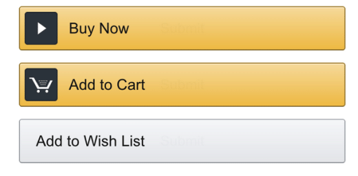
Elements that include it inside:
- Input fields
- Pressed buttons
- Slider tracks
- Unselected radio buttons
- Checkboxes
Elements that include it outside:
- Unpressed buttons
- Slider handles
- Dropdown controls
- Selected radio buttons
- Pop ups
As described in Flat Design Trends, Present and Future, using a semi-flat design gives you the best of both worlds when addressing the elements. The mobile interface will look modern.
6. Cut the clutter
The user should be able to complete tasks quickly and in as few steps as possible.