
75
/ 100
SEO score
For some reason, and almost without noticing, we have come to think that technology is the only answer to all the problems in our lives. That philosophy has led to more and more apps in the stores. Having lots of options only makes things harder for your potential users, who have more to choose from. And what is worse, they may already have an app installed that solves the same problem as yours. For this reason, many people don’t even download new apps, and we can understand it: why get a new app if they already have what they need?
Even so, if you have done a good job of promotion, and your proposal is good and built with UX in mind, they may give you a chance. But it may also last less than you think: if your first screens have problems or are not well solved, they will leave the app. And when they do, it is to never come back. And you know, there is no second chance to make a good first impression.
So it is essential that you start on the right foot and focus on getting good UX from the very first moment.
Sign up and login
There are very few apps where a user arrives determined to sign up and leave their personal data, no matter how much time or effort it takes. Maybe that is the case with Facebook or Twitter, or some other essentialapp in daily life, like the ones you install as soon as you get a new phone.
But let’s be honest: most likely yours is not one of them.
A sign-up form as the first screen will make the user hesitate and wonder whether it is really worth handing over their personal information (once again) to a product they don’t know. Trust is a scarce good these days. And we are not even talking about what would happen if the form has many fields, or special requirements that were not properly communicated beforehand.
Imagine you go to the supermarket, and before you enter, and before you even know whether they have the product you want, a person at the door asks you to leave your details to let you in.
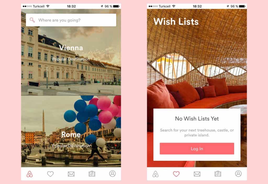
To be fair, there are few apps that really need a user account to be used. Although we want the user to sign up, most of the time it is not strictly necessary. Those that need it are also useless without an account. For example, the ones that need a profile to connect with other users and so enrich the experience, or the ones that need to sync information between devices.
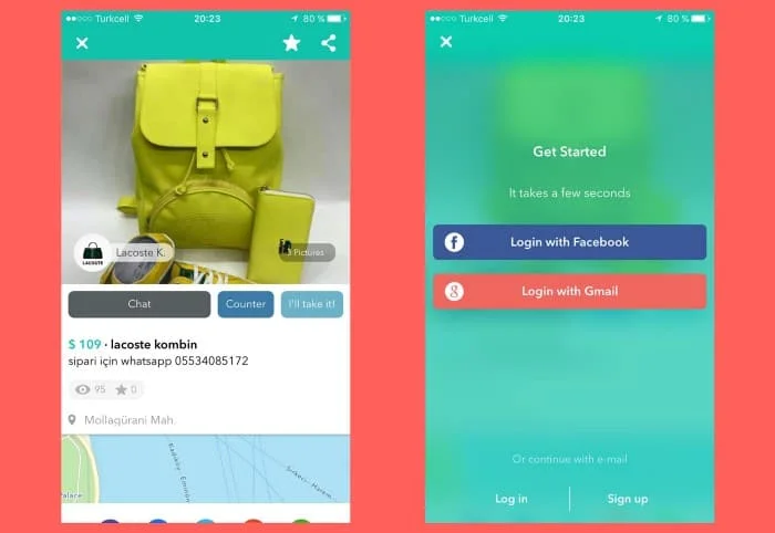
If it works in your case, consider postponing sign-up as long as possible, until it is unavoidable to continue. Some apps offer basic functionality, or a limited set of features, that act as a “test drive”.
If the user is happy with this first trial and can clearly see the value of signing up, they are very likely to do it. So my recommendation is to present sign-up as far from the first screen as you can. This kind of thing helps UX improve conversion and experience.
Tours and other welcome screens
When someone finally installs your app, they already have some information about what it is. If they made that decision, it was because they read a review on a blog or someone recommended it, for example. It could also be that they found it by chance in the store while looking for something they needed. Even then, before downloading and using it, they most likely looked at the description, the comments and ratings from other users and the screenshots.
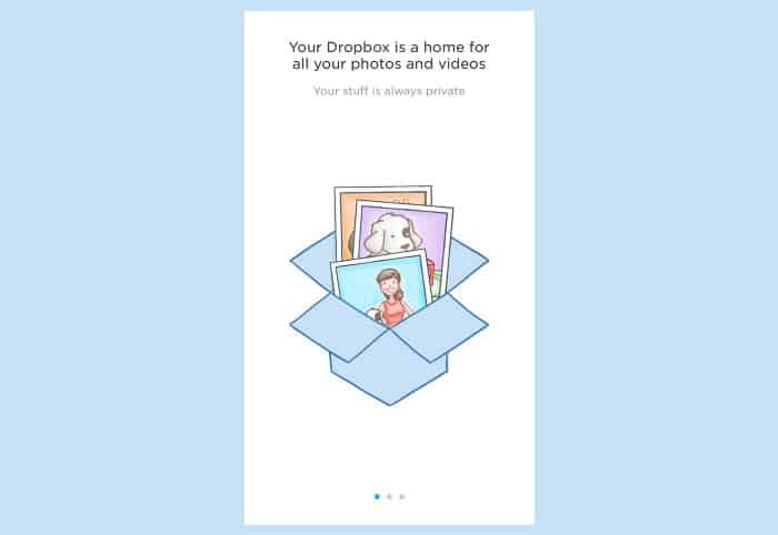
In short, they already know the basics of your app, and they don’t need this information again in the form of explanations or screens with the highlights of your proposal. They know what it does, and now they want to check for themselves whether it is true.
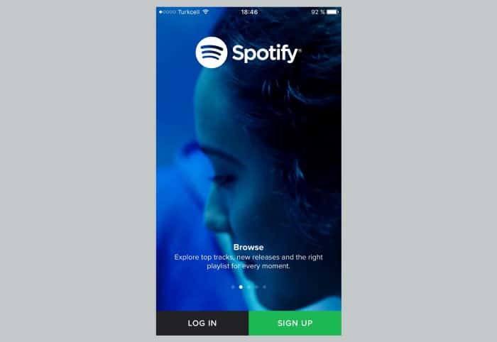
In the “real world”, when you buy a new TV, do you read the manual before using it? I bet you don’t. Neither do I. You plug it in, turn it on, and start pressing buttons on the remote.
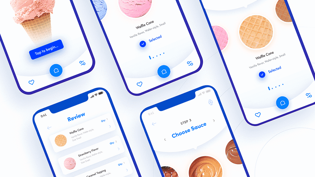
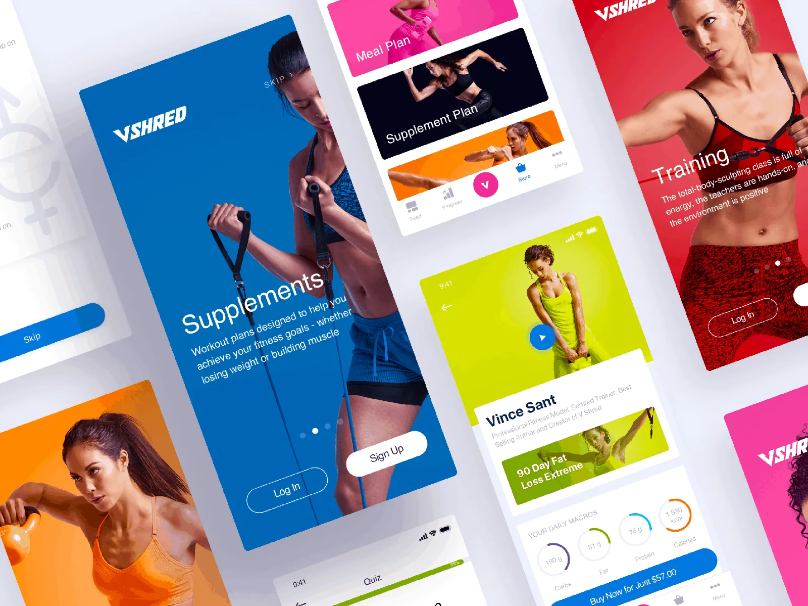
So-called walkthroughs or welcome tours are the equivalent of an instruction manual, except that in some cases we are even “forced” to go through all the pages of this manual before we can use the product. I once heard someone (I won’t name names) from a development team say something like “It doesn’t matter if the user doesn’t fully understand this tool, we’ll add an explanation in the welcome tour later”.
A good product with good UX doesn’t need instructions. Walkthroughs are for lazy designers who didn’t take the time to find the best way to do something. It also makes no sense to use this tour to explain basic operation, or the meaning of buttons or icons.
Following the previous supermarket example, think about what would happen if, right after entering the store, an employee told you where the fish is, how to queue or how to pay, long before you need it. When the moment really comes, you will have forgotten all of it.
Most likely, in their eagerness to reach the “main screen”, users will pay no attention to what you are explaining and will quickly go through the tour without even reading anything. And even if they do read something, with a bit of luck they will surely have forgotten everything by the time they start using the app.
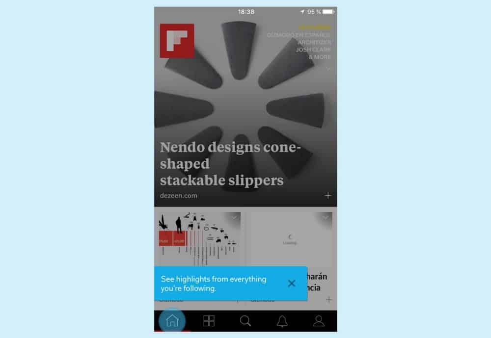
Instead of using these explanatory screens, from a UX point of view I suggest you use contextual help, at the moment and place where the user really needs it. That way, you make sure that what you are explaining is more relevant and effective. To achieve this, you can split up the information you consider essential and place it strategically on different screens during the first uses of the app.
Don’t underestimate users who want to explore and learn to use it by themselves. Curiosity is something you could benefit from, if you want. Some people even want to make mistakes, and find out for themselves how everything works, without anyone telling them.
You may be interested in: Four ways to improve interaction
Asking for permission
The same sense of timing I mentioned before also applies to UX changes for when you want to ask the user whether you can send them notifications, access their contacts or their location, for example. This situation is even worse when you need more than one of those permissions. You could risk scaring an unsuspecting user who doesn’t even understand why they need to accept all that.
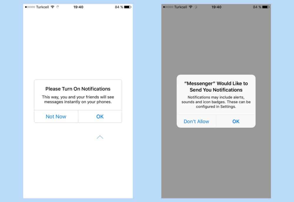
In situations like these, instead of asking for permission in a dramatic way and all at once, you can ask for it at the moment you really need it.
You can also prepare the user for this crucial moment by adding an extra screen that explains what is about to happen. This should be used to explain in a clear, honest and concise way so that not only you, but the user too, understands the value of accepting.
Conclusion with UX
Many of our UX mistakes, when a potential user is trying an app for the first time, are related to putting obstacles in their way. Users just want to take your app for a spin as soon as possible. So these mistakes I mention are often caused by our anxiety to reach business goals or improve metrics, without considering how the user benefits or how it helps them solve their problems.
So, to sum up, the key may be to split up the information and reveal it gradually, when it is appropriate. This way, you can get a more effective first experience that will, hopefully, convince your user that your app is worth it.